LEYA'S BATH
Introduction
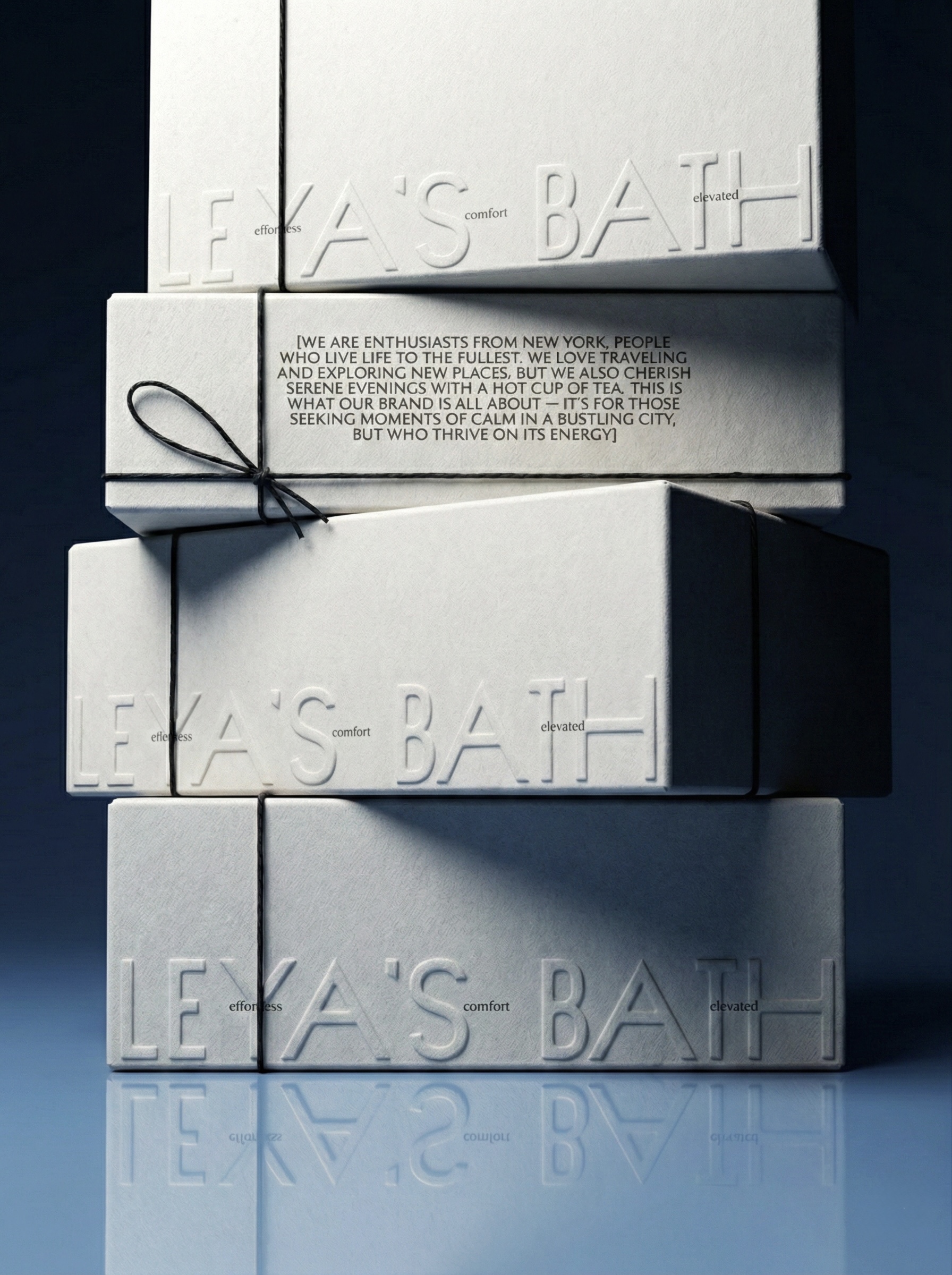
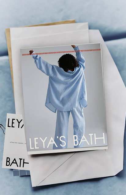
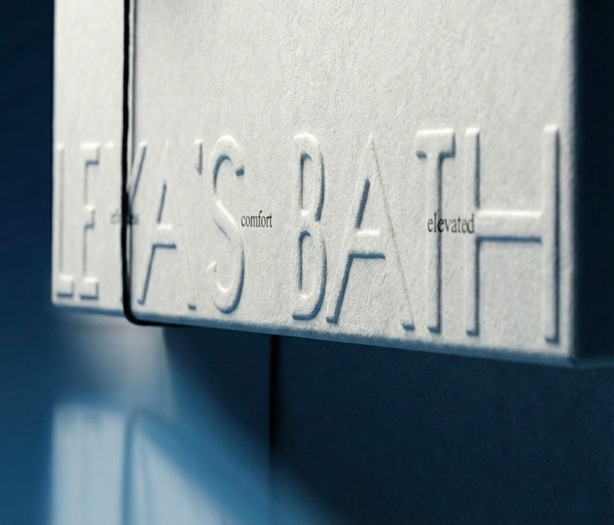
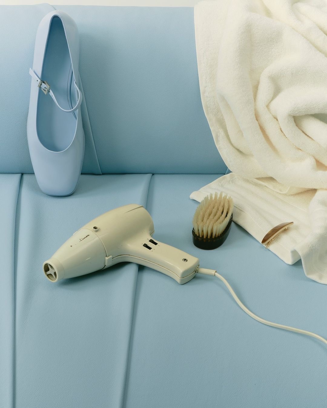
A packaging-focused identity for a bath and body brand, designed to feel clean, minimal, and product-driven. The visual system emphasizes form, materiality, and clarity.

Process
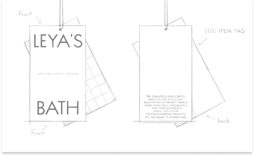
We approached this project as an exercise in restraint. The brand had a strong point of view from day one - but it needed a visual language precise enough to carry it. We worked through multiple rounds of packaging prototypes, testing how form, texture, and typography interact on shelf. The result is a system that communicates quality without explaining itself.
Conclusion
The identity is designed as a scalable system – allowing the brand to expand across packaging, print, and digital touchpoints. Each element works together to create a clear and cohesive visual language.