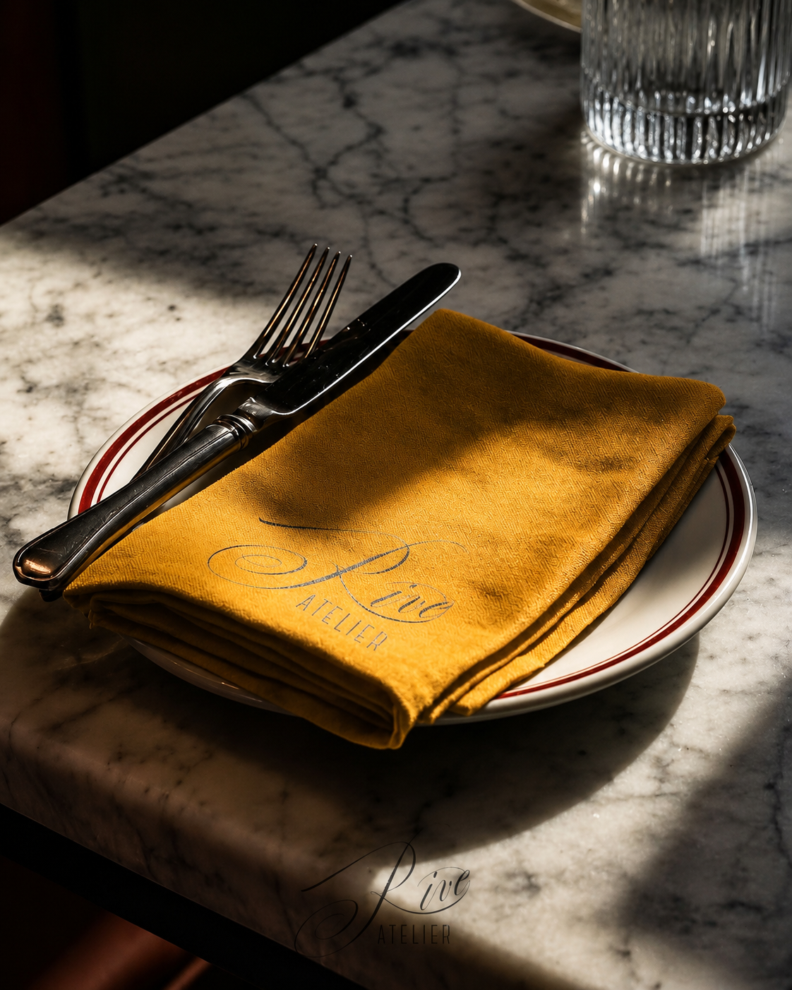
RIVE
Introduction
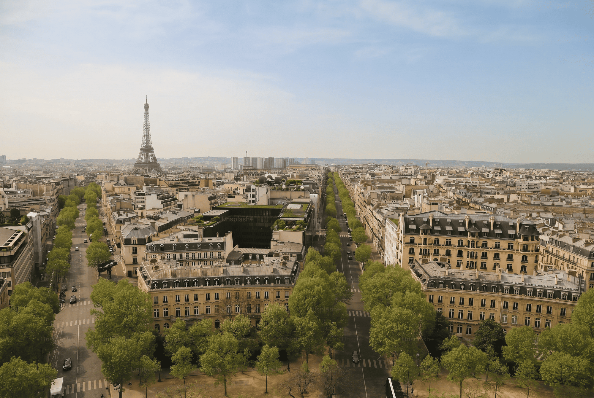
A brand identity for a Parisian coffee atelier, designed around warmth, ritual, and quiet everyday elegance. The visual system is built around tactile materials, soft typography, and a refined café atmosphere.
Process
Research and Discovery
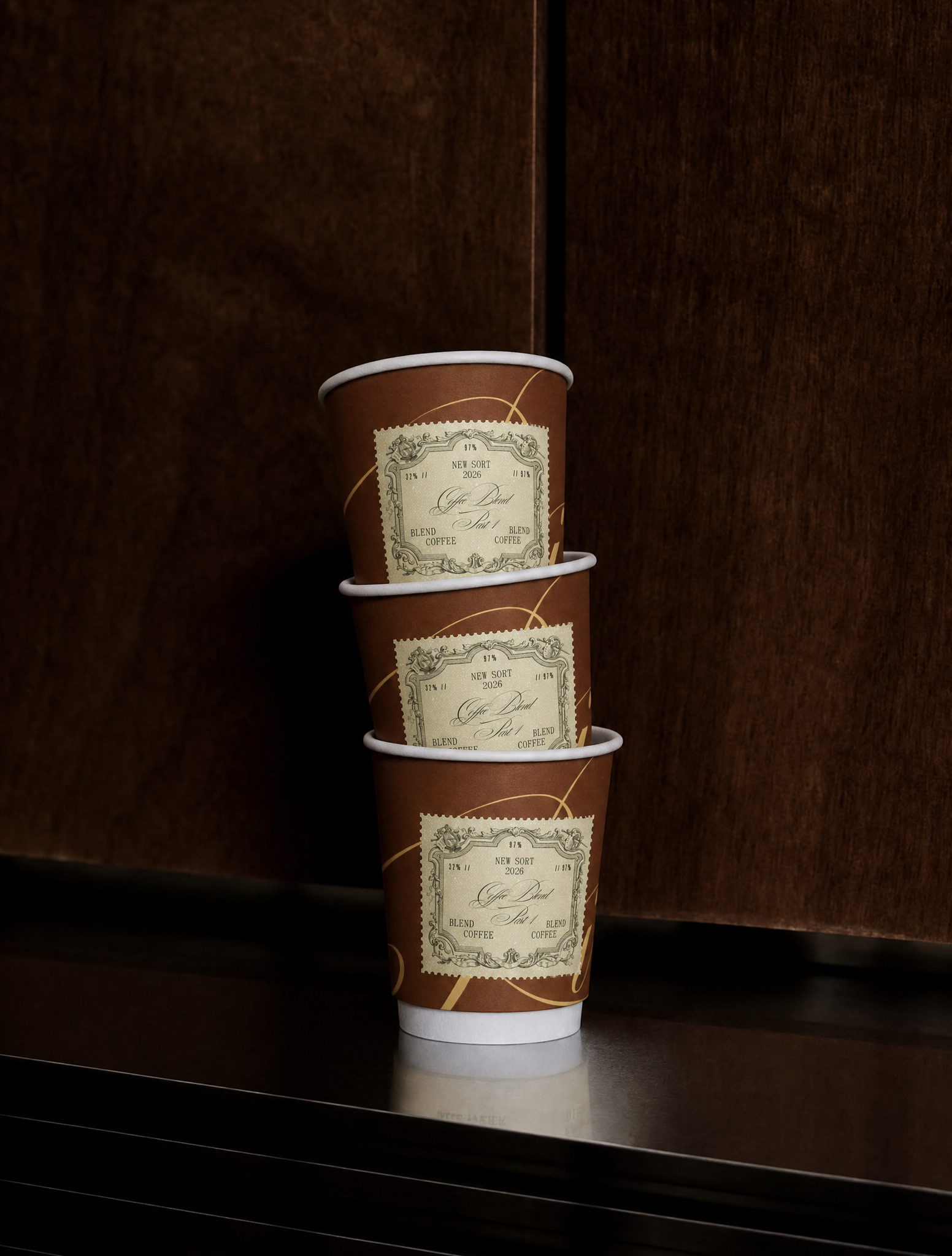
The starting point was a feeling, not a brief: the small ritual of a Parisian coffee moment - paper cups, warm light, handwritten notes. The goal was intimacy without ornament, elegance without effort.
Visual Direction
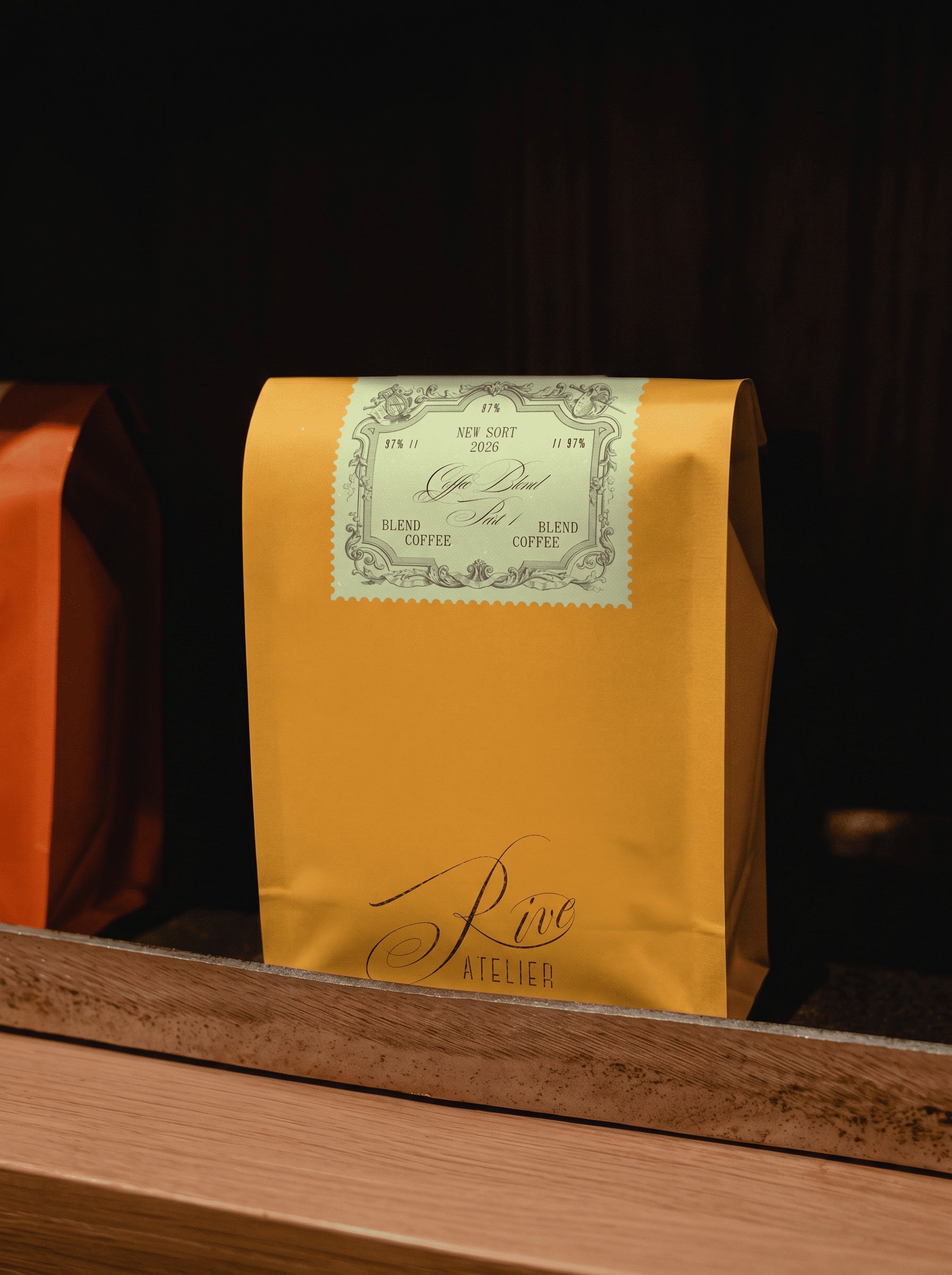
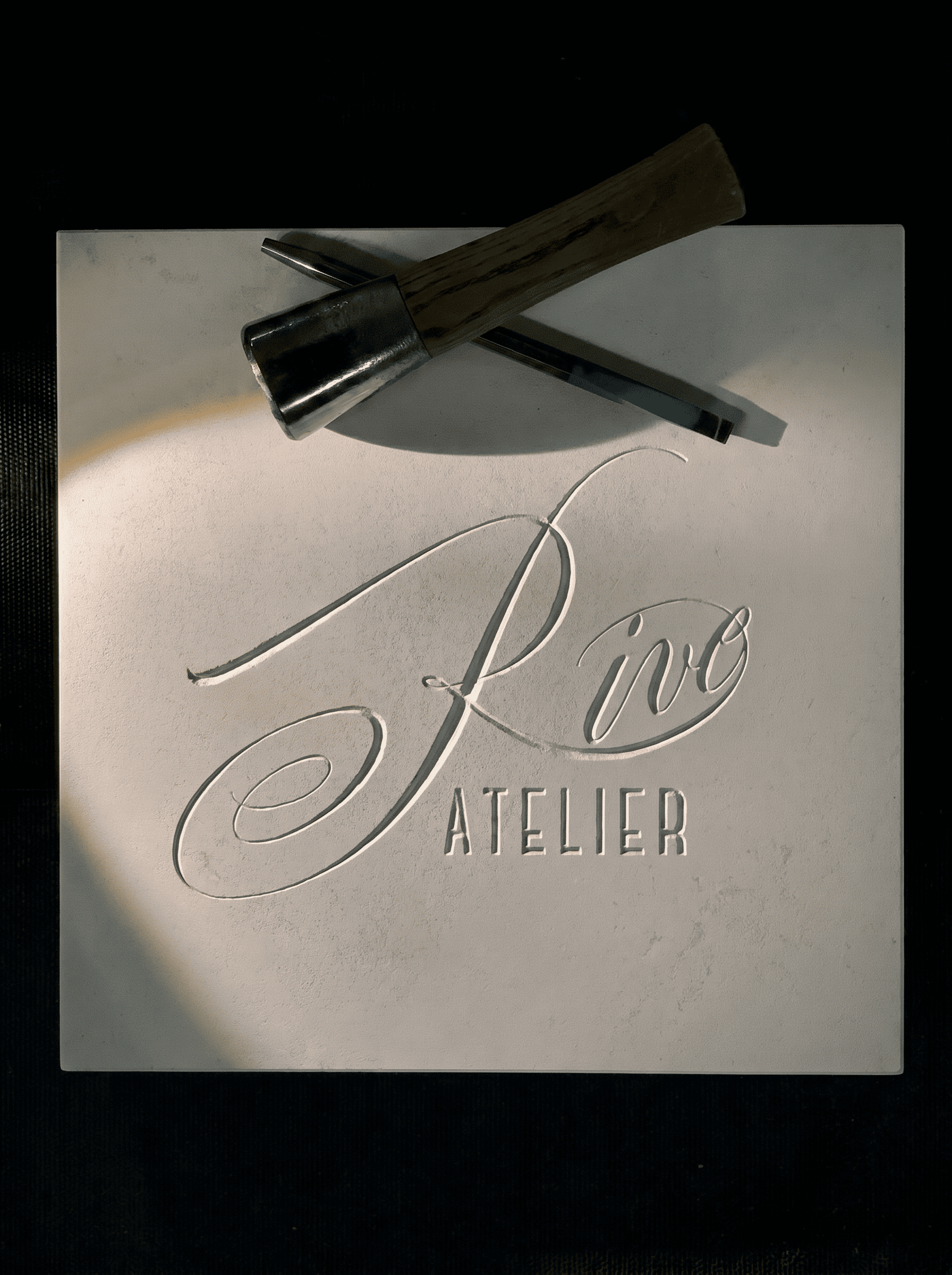
Typography carries the emotional weight of the brand, supported by soft materials and warm, unforced tones. Packaging stays simple by design - nothing is added that isn't earning its place.
Typography and System
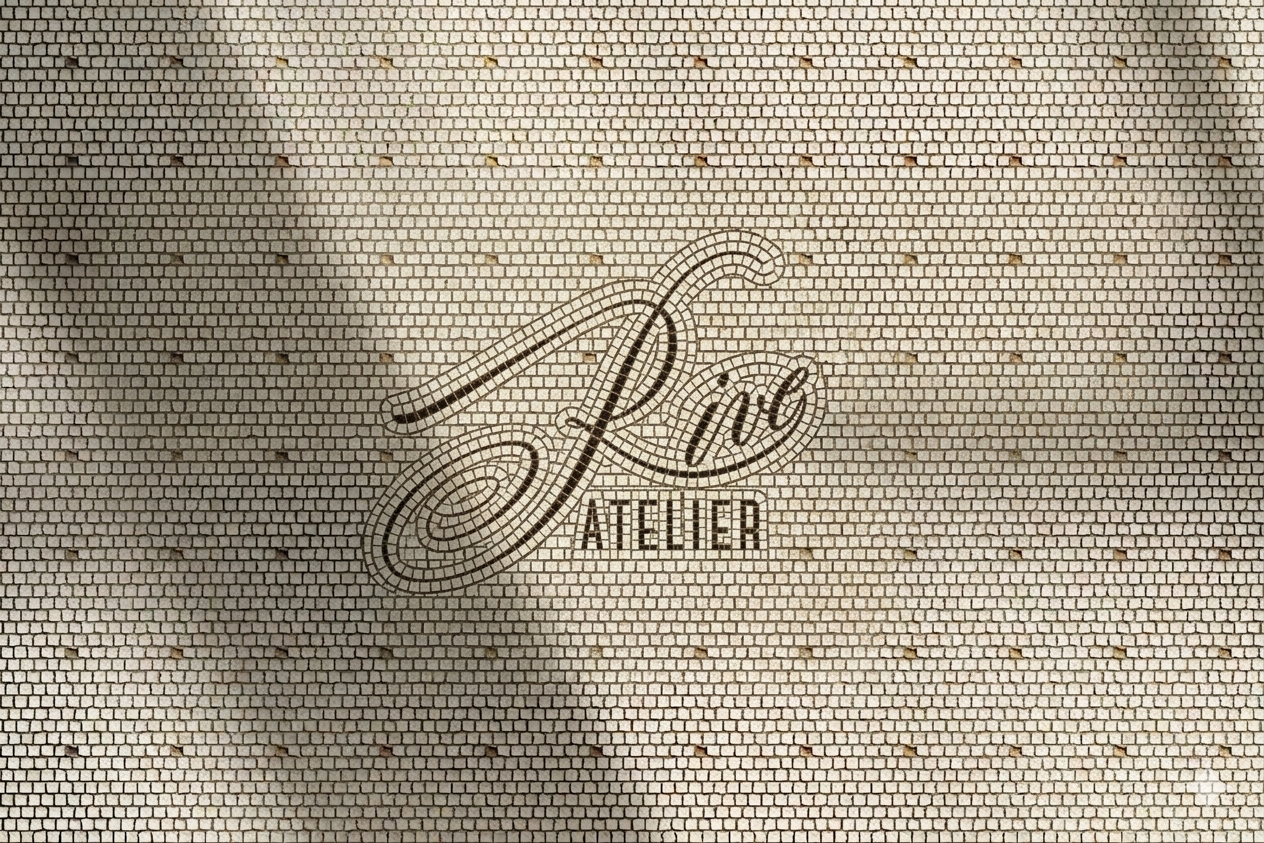
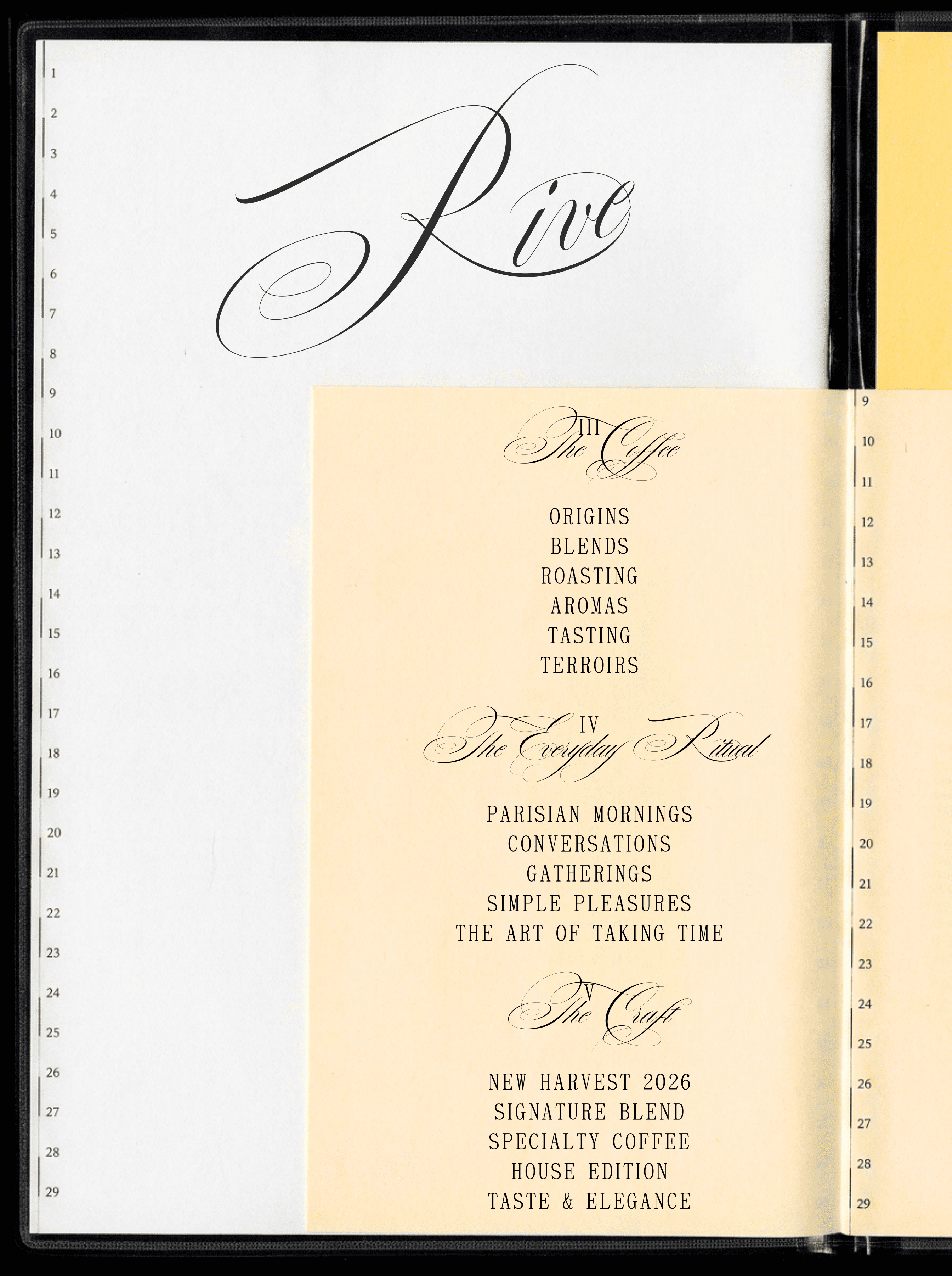
The same type-led language runs across cups, bags, and printed menus, calibrated to feel handmade at every touchpoint while staying exactly consistent at scale.
Conclusion
The project explores the balance between craft and simplicity - where coffee, packaging, and atmosphere work together as one experience. Designed for a competitive café market, Rive creates a soft but memorable identity with a clear Parisian character.