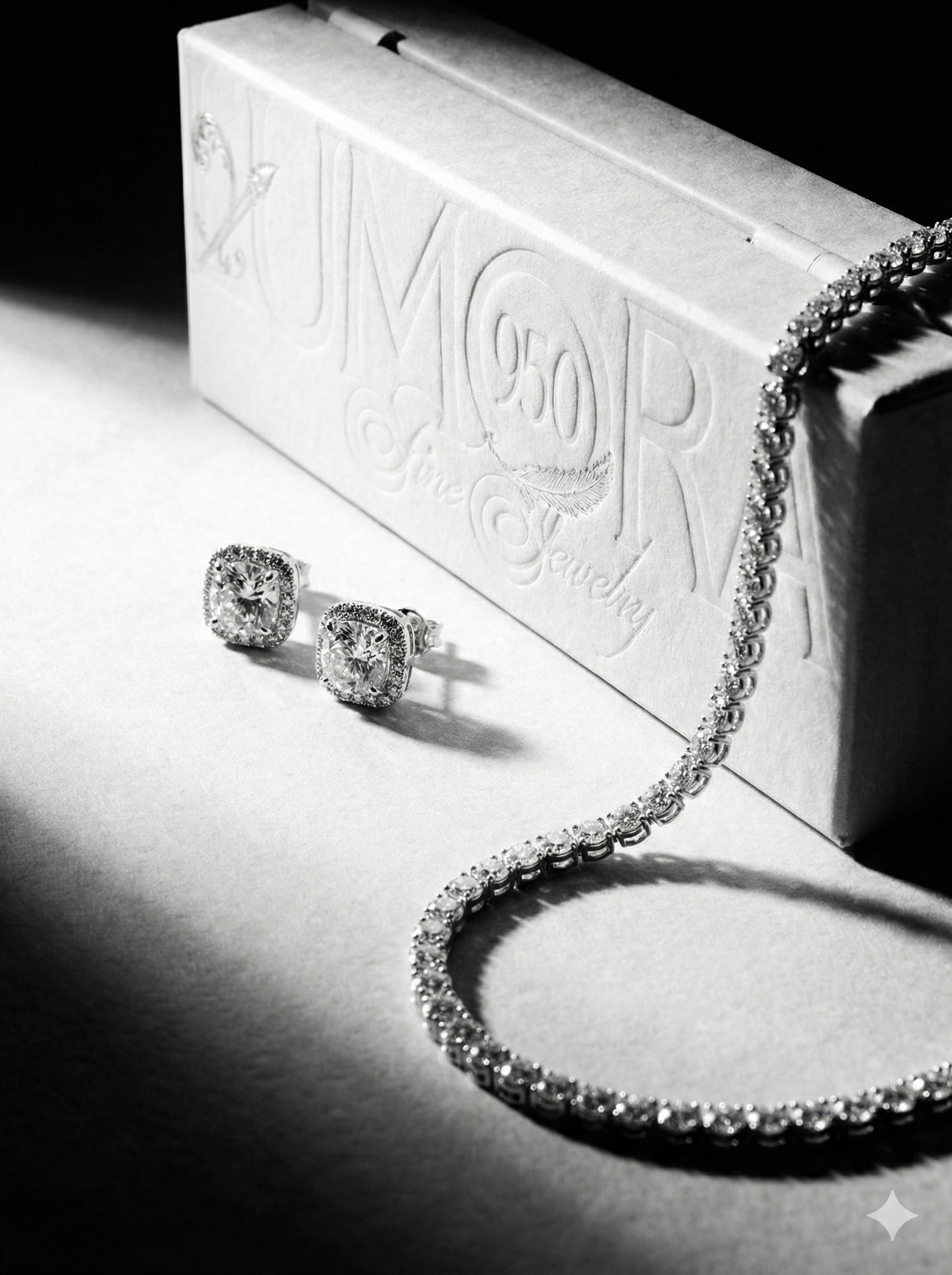
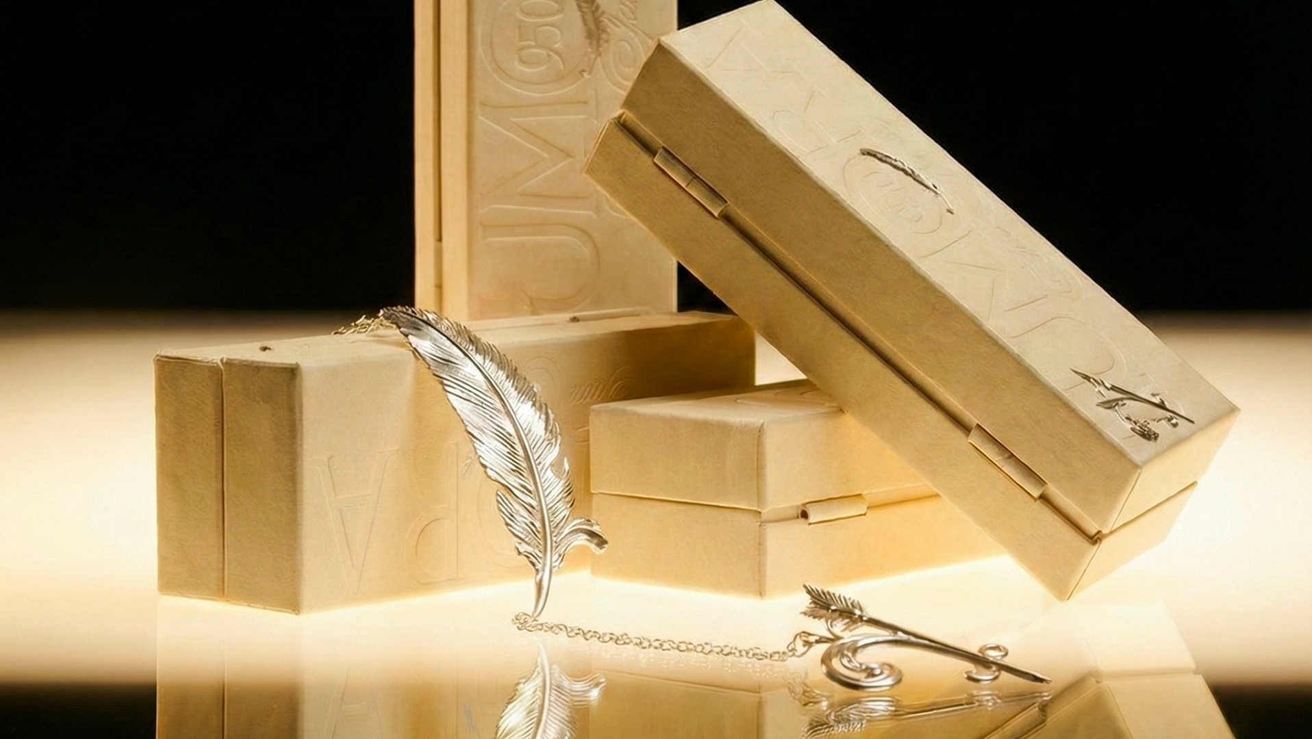
LUMORA
.jpg)
Introduction
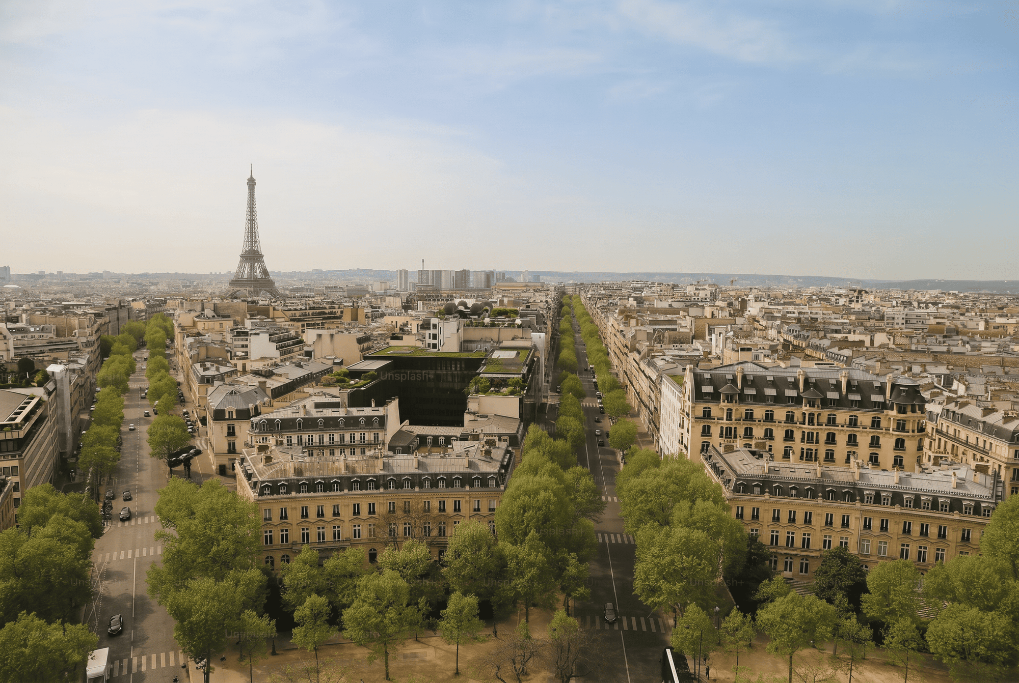
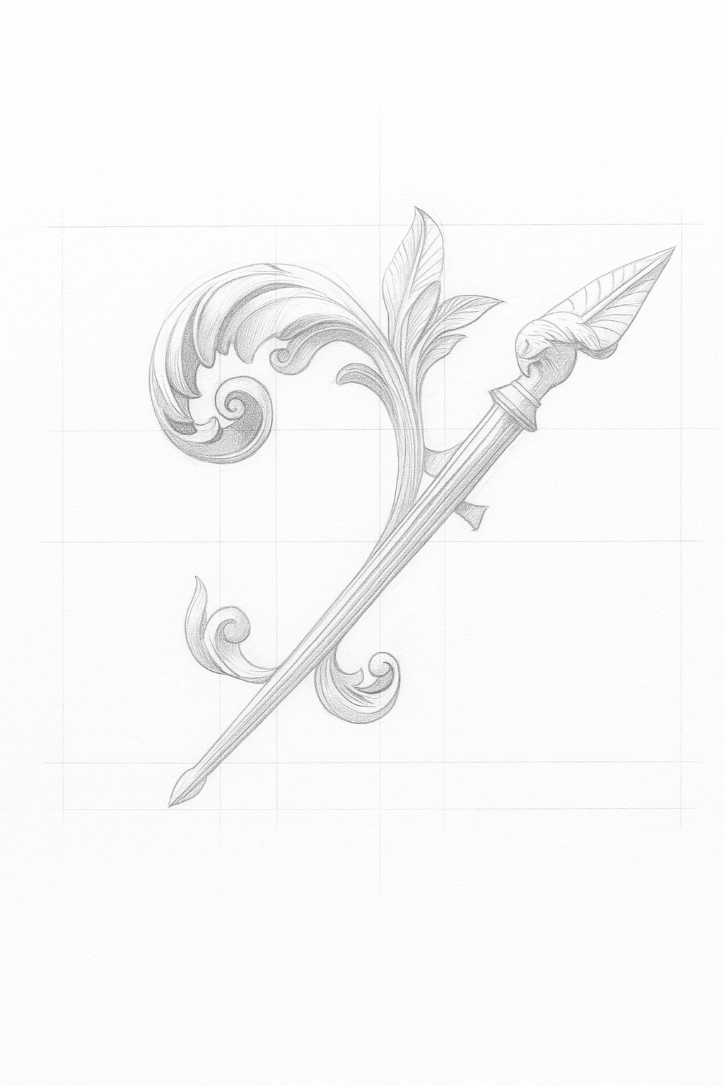
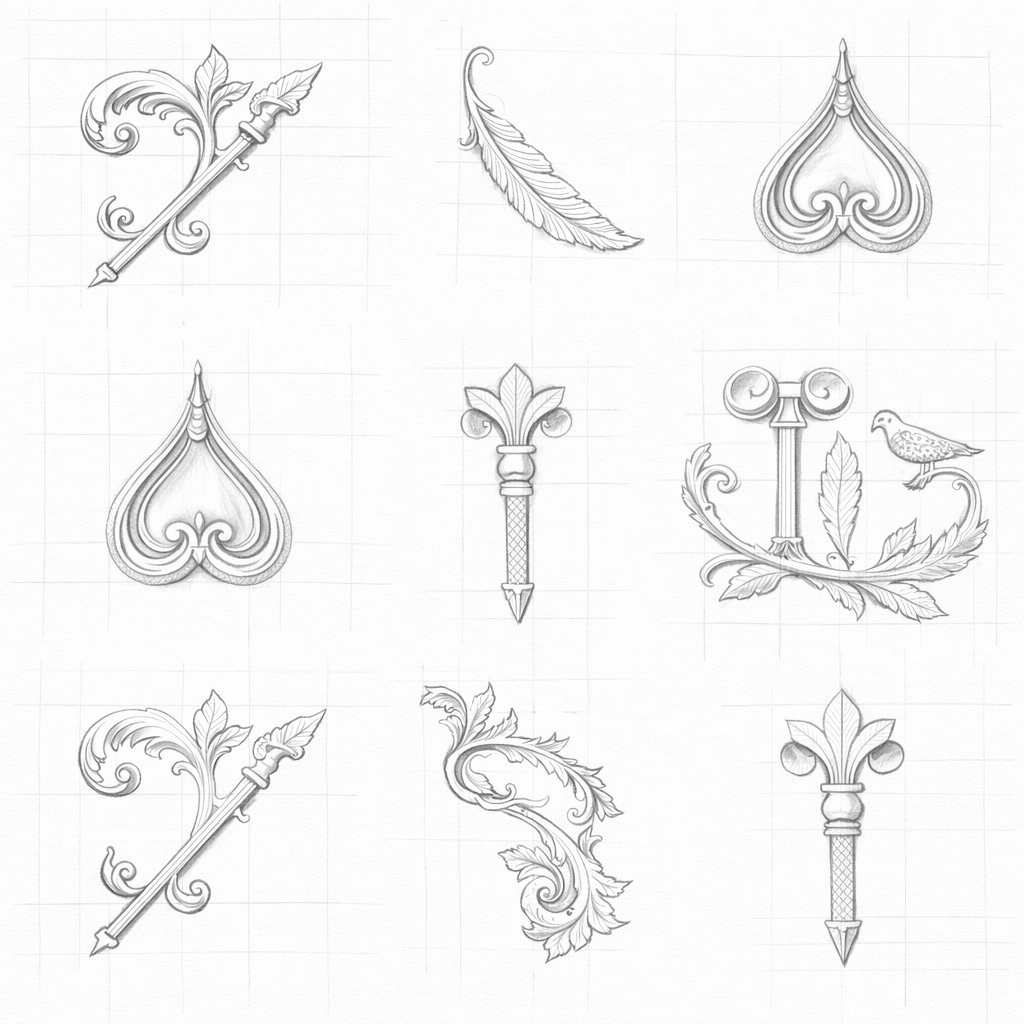
A jewelry brand identity developed
with a focus on precision, detail, and visual refinement. The concept draws from ornamental forms and delicate structures.
Process
Research and Discovery
The process began by stripping away every reference that pointed elsewhere - anything borrowed from other jewelry brands had to go before the real brand could surface.
Visual Direction
What followed was slow and deliberate: the exact weight of the logotype, the spacing of the type system, the surface quality of the packaging materials. Nothing was chosen for effect.
Typography and System
The system was built for permanence, not trend - tested to hold up under the kind of close inspection fine jewelry invites, at every scale from hallmark to catalogue.
Conclusion
The project explores balance between aesthetics and function – where every element, from typography to materials, contributes to a consistent brand experience. Designed to stand out within a competitive market, the identity creates a clear and recognizable positioning.