LEYA'S BATH
Introduction
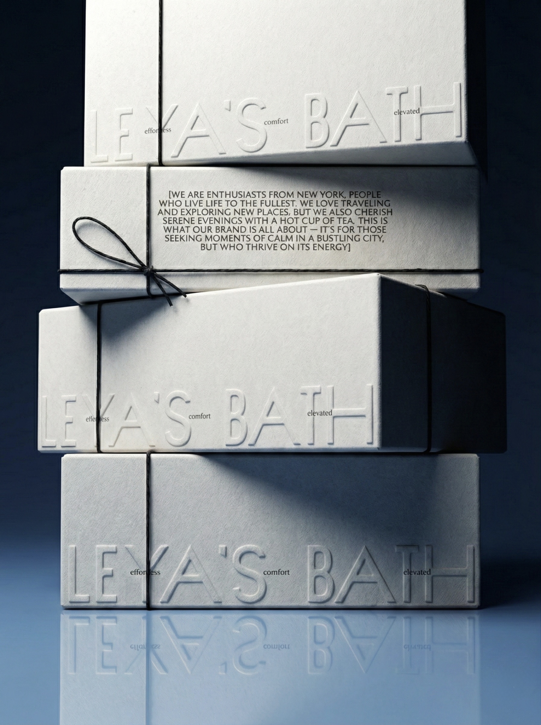
A packaging-focused identity for a bath and body brand, designed to feel clean, minimal, and product-driven. The visual system emphasizes form, materiality, and clarity.


Process
Research and Discovery
The brand already had a strong point of view before the project started. The task was translating that conviction into a visual language precise enough to carry it without diluting it.
Visual Direction
Multiple rounds of packaging prototypes tested how form, texture, and typography actually behave on shelf, not just on screen. The result favours clarity over explanation.
Typography and System
Built packaging-first, the system extends to print and digital without loosening its proportions - the same restraint holds at every scale.


Conclusion
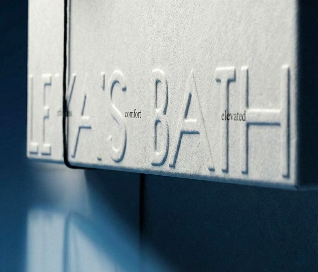
The identity is designed as a scalable system – allowing the brand to expand across packaging, print, and digital touchpoints. Each element works together to create a clear and cohesive visual language.