KALUGA
Introduction
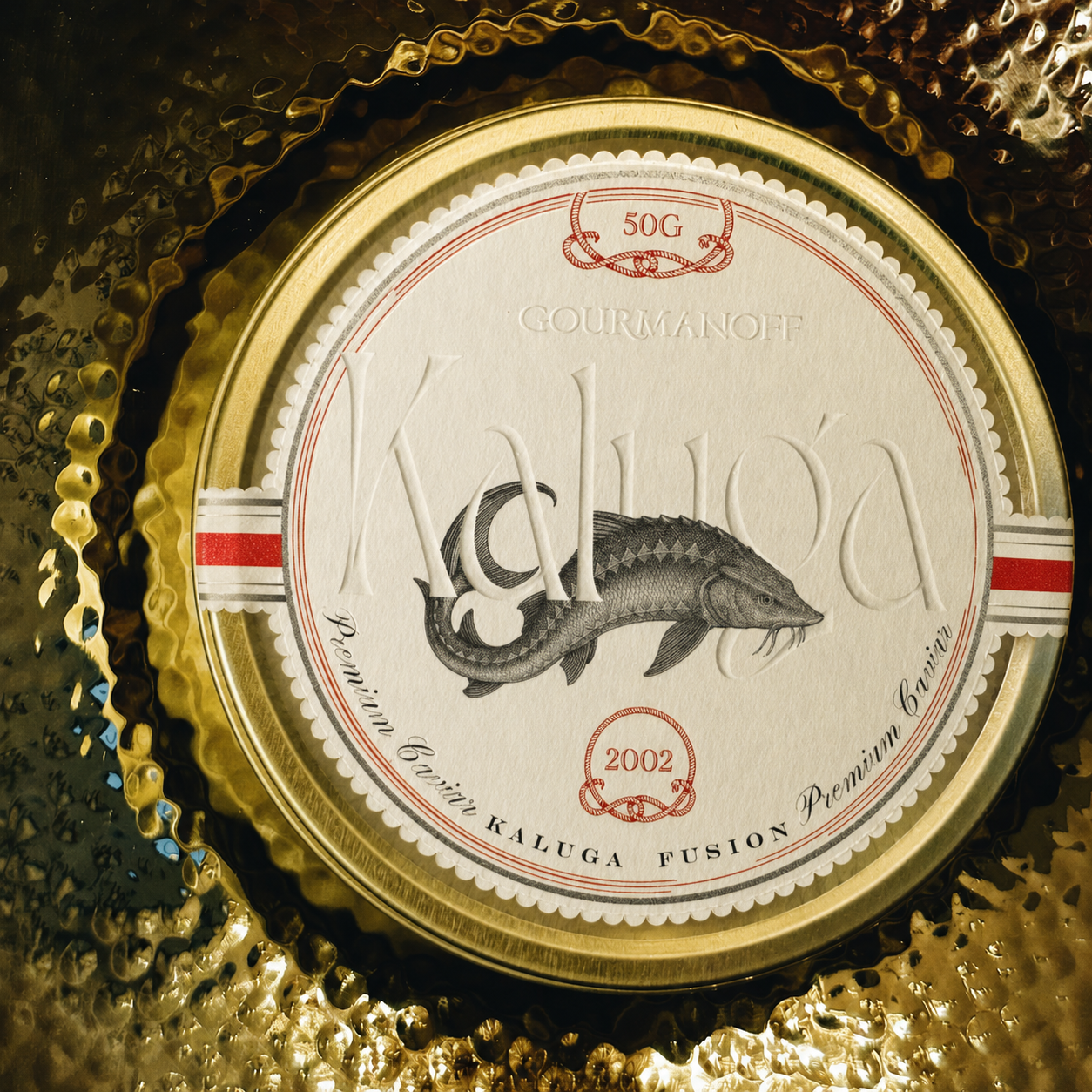
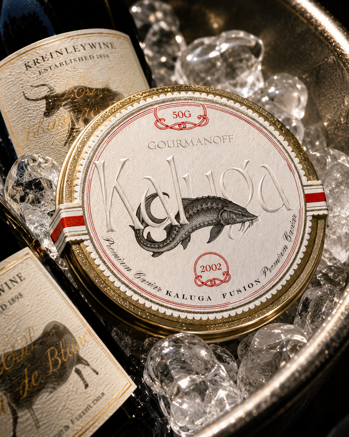
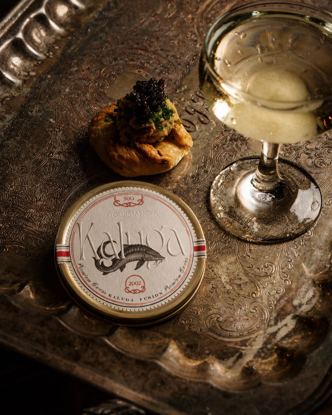
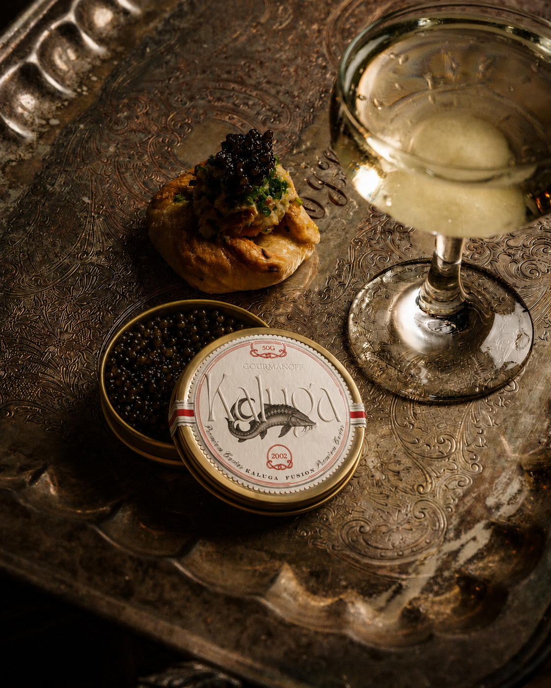
A brand identity for a premium caviar brand based in New York, designed around heritage, rarity, and quiet luxury. The visual system combines dark elegance, refined typography, and tactile packaging with a discreet gourmet mood.
Process
Research and Discovery
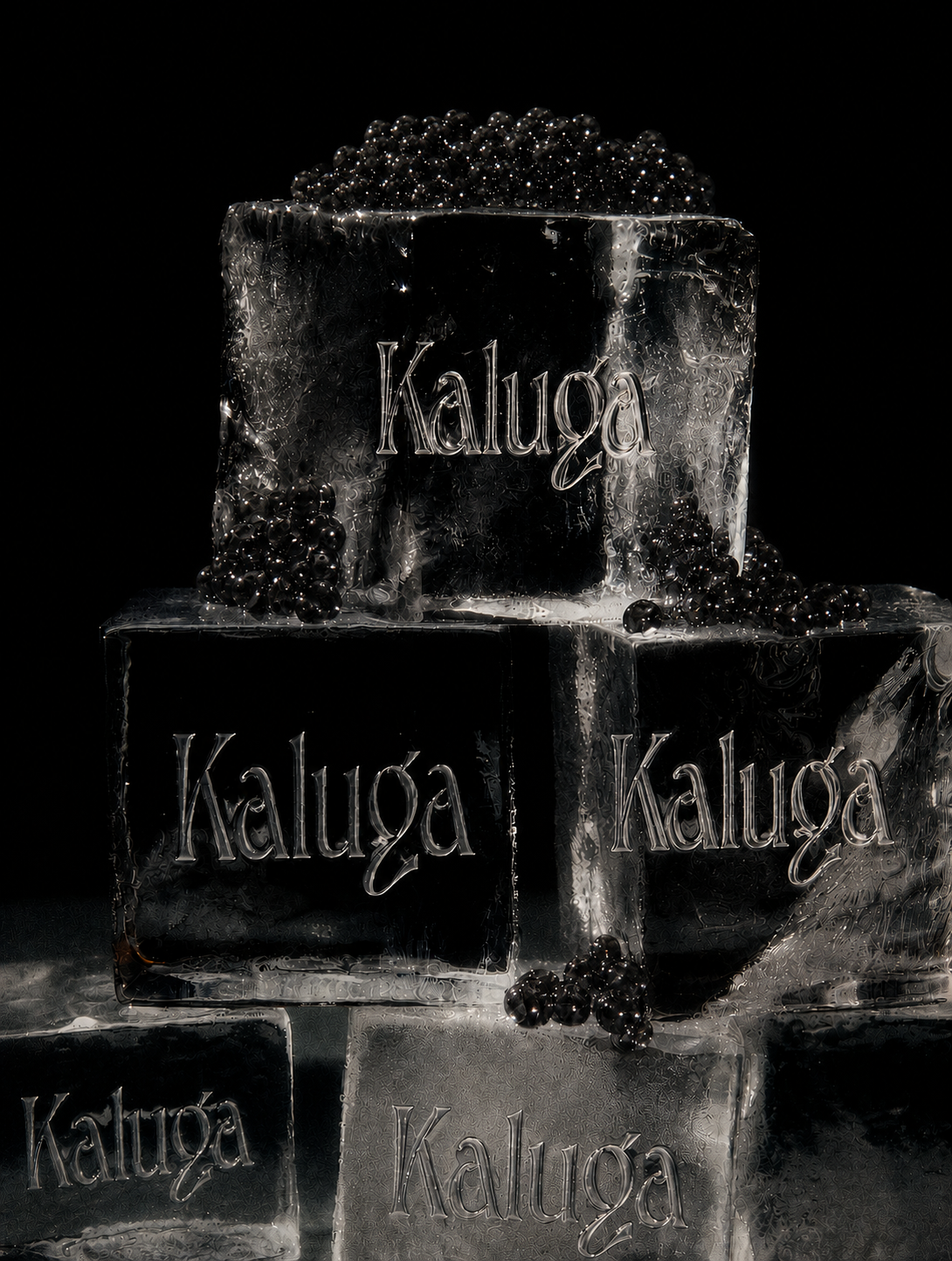
The process studied the codes of fine dining and old-world delicacy - silver trays, cold glass, black ice, handwritten menus. The brief: exclusive, never loud.
Visual Direction
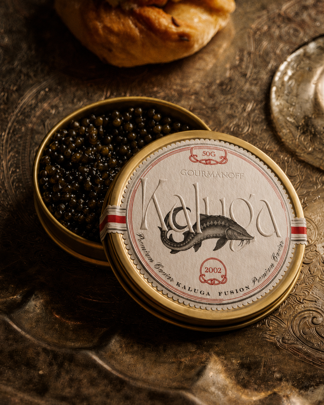
Typography and packaging detail became the primary visual language, held together by deep tones, subtle contrast, and editorial composition rather than ornament.
Typography and System
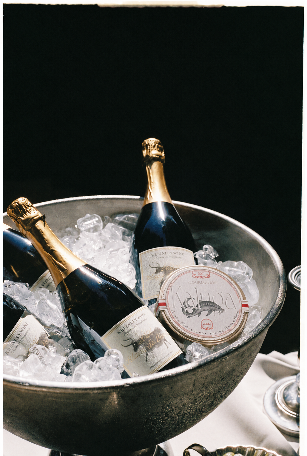
The system extends from label to gift box to restaurant presentation as one continuous mark of quality, built to carry a premium gourmet position with a distinct New York presence.
Conclusion
The project explores the balance between luxury and restraint - where rarity, taste, and presentation work together as one brand experience. Designed for a premium gourmet market, Kaluga creates a sophisticated identity with a strong New York presence and timeless appeal.