FLEUR DOMBRE
Introduction
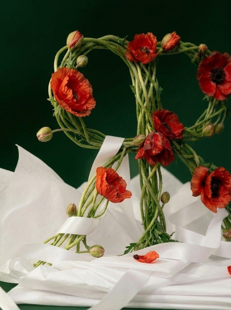
A brand identity for a floral concept store and café, designed to evoke emotion through color, texture, and composition. The visual system is built around contrast – delicate floral elements combined with bold, expressive forms.
Process
Research and Discovery
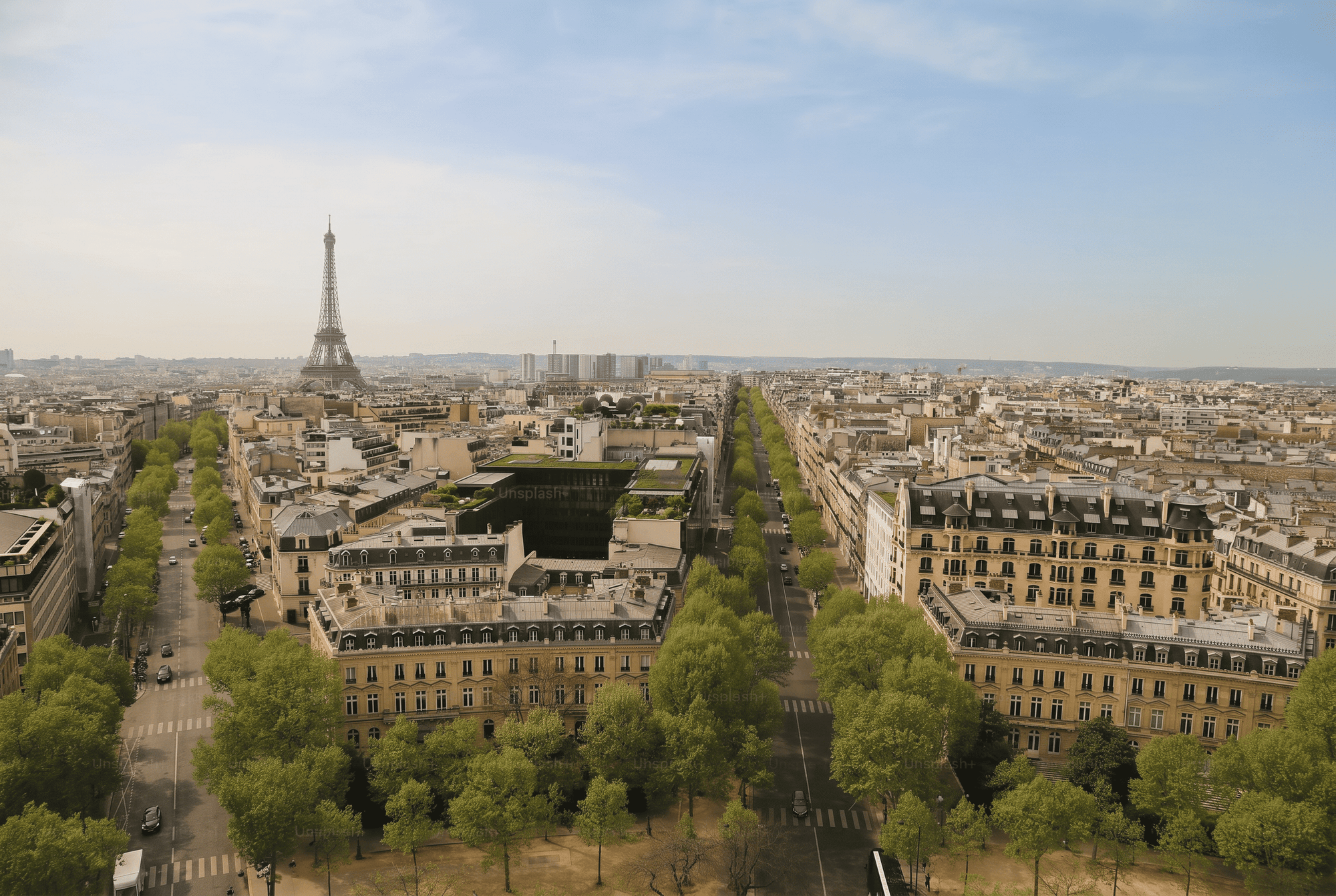
The process began with an immersion into Parisian floral culture - its history, its rituals, its contradictions. The brief was clear from the first conversation: rooted, not decorative. The core tension that shaped everything downstream: wild botany against editorial restraint.
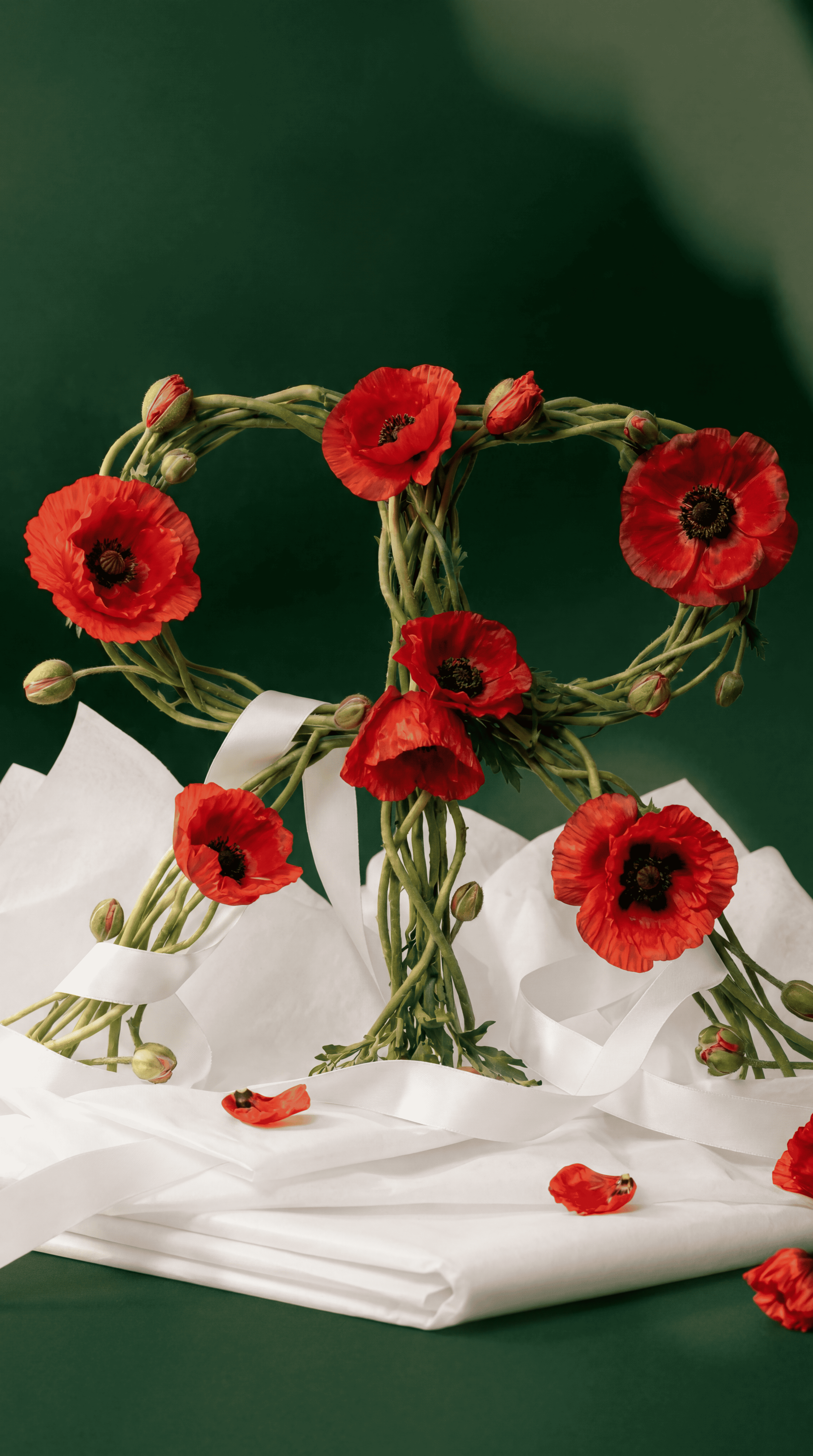
Visual Direction
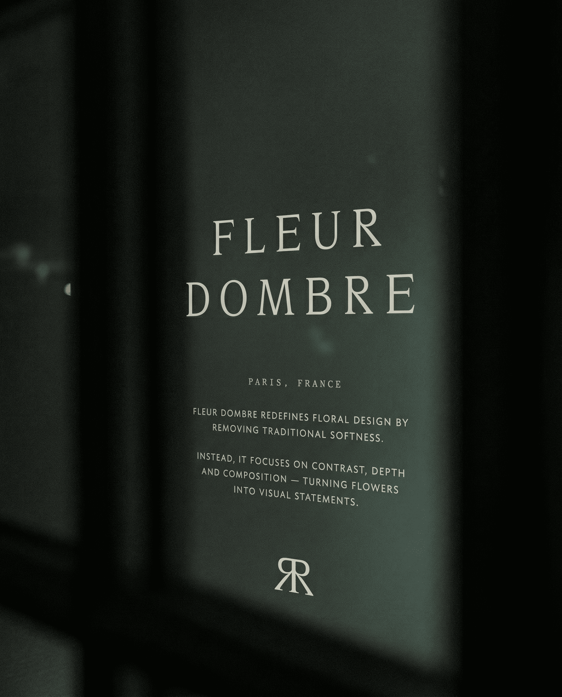
The identity holds that tension deliberately. Botanical looseness is allowed to exist, but only inside a structured, editorial composition. The colour system avoids literal floral cliché entirely, drawing instead from dried flowers and dark earth.
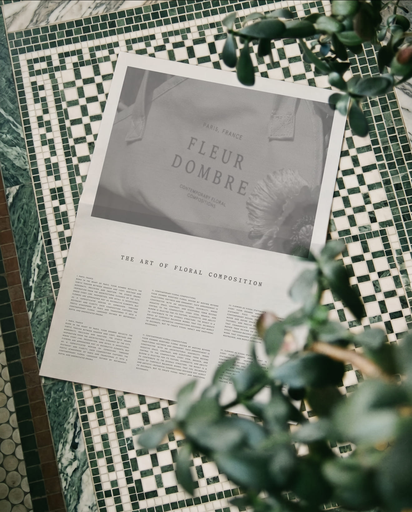
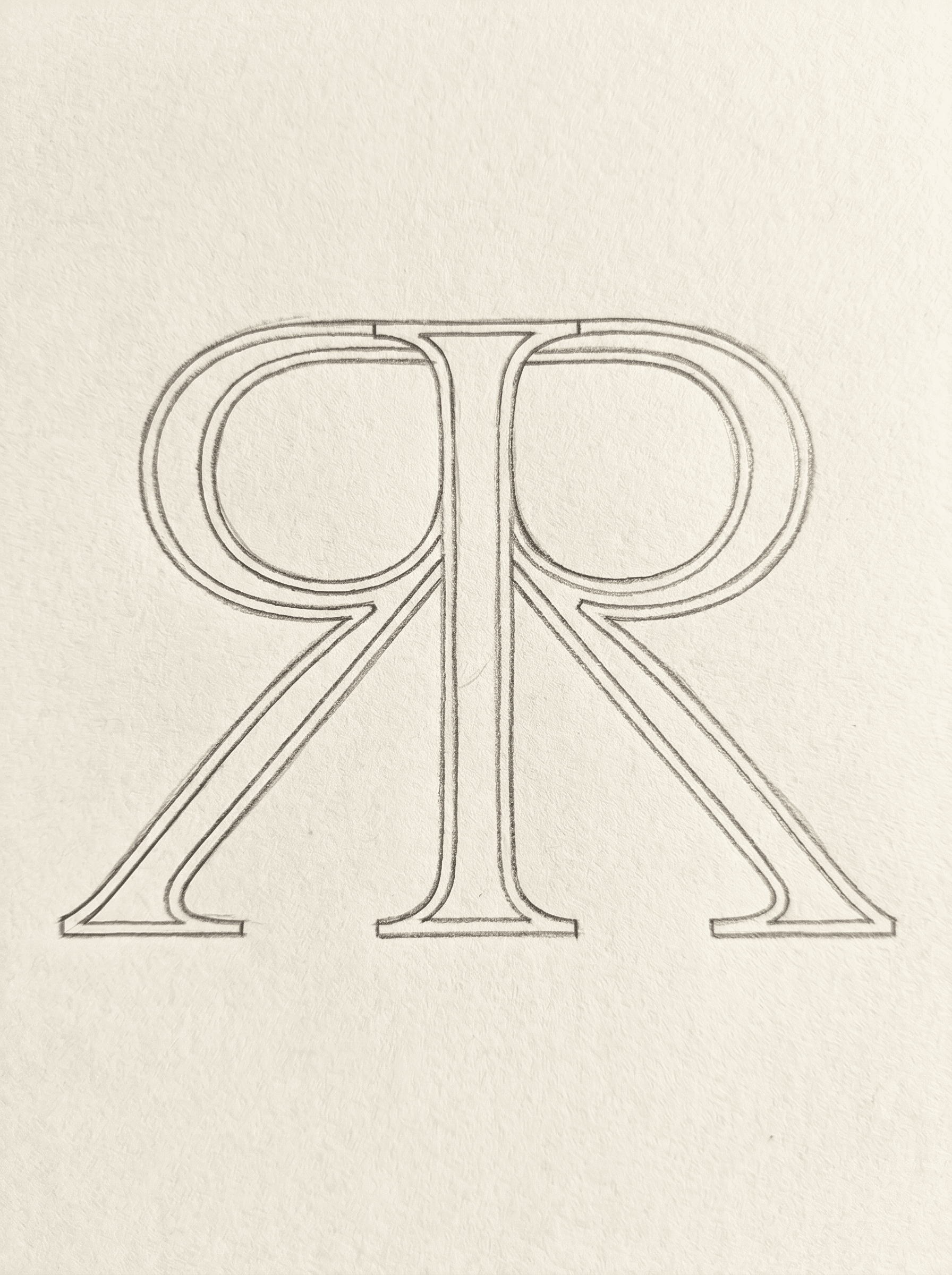
Typography and System
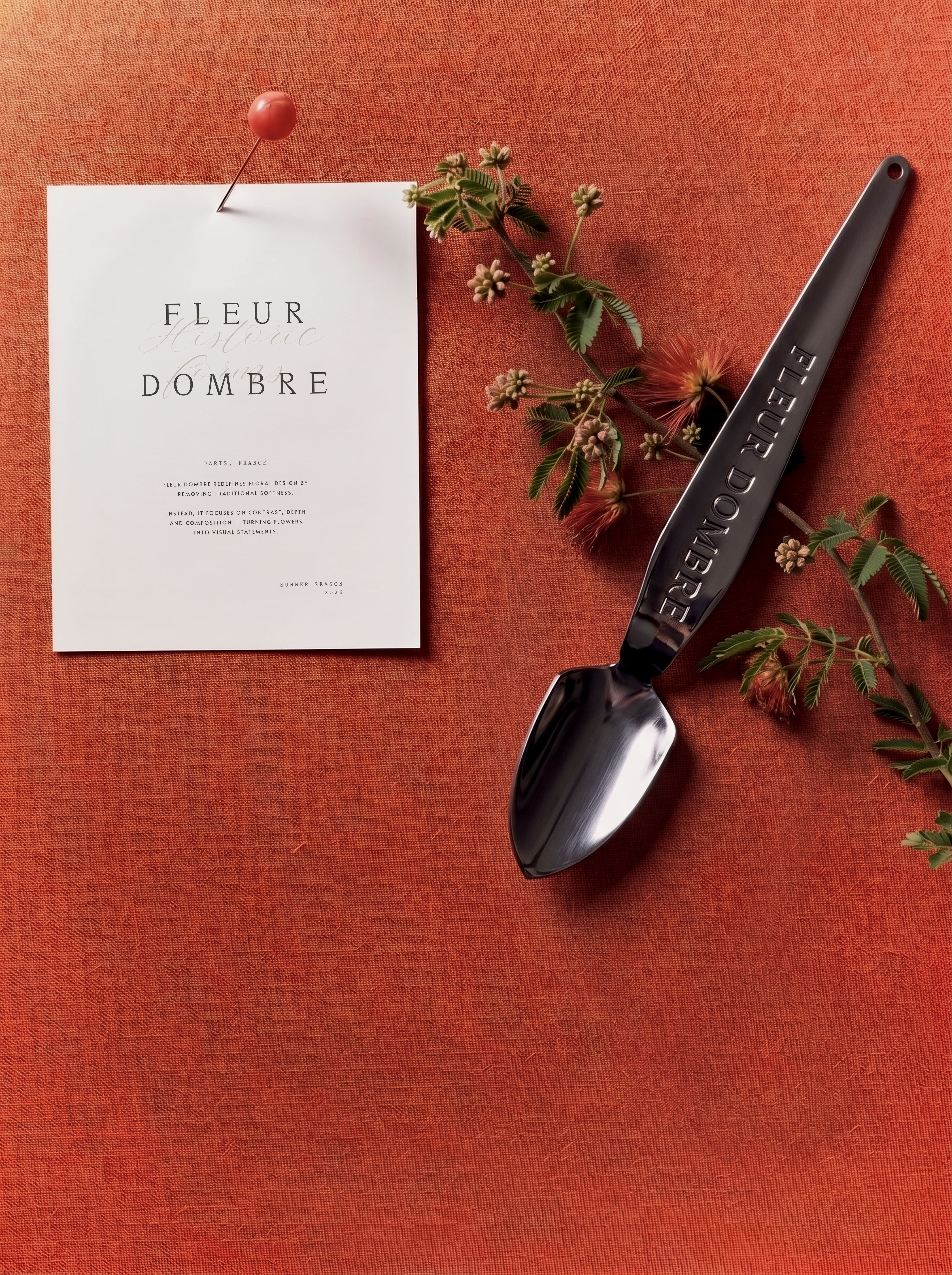
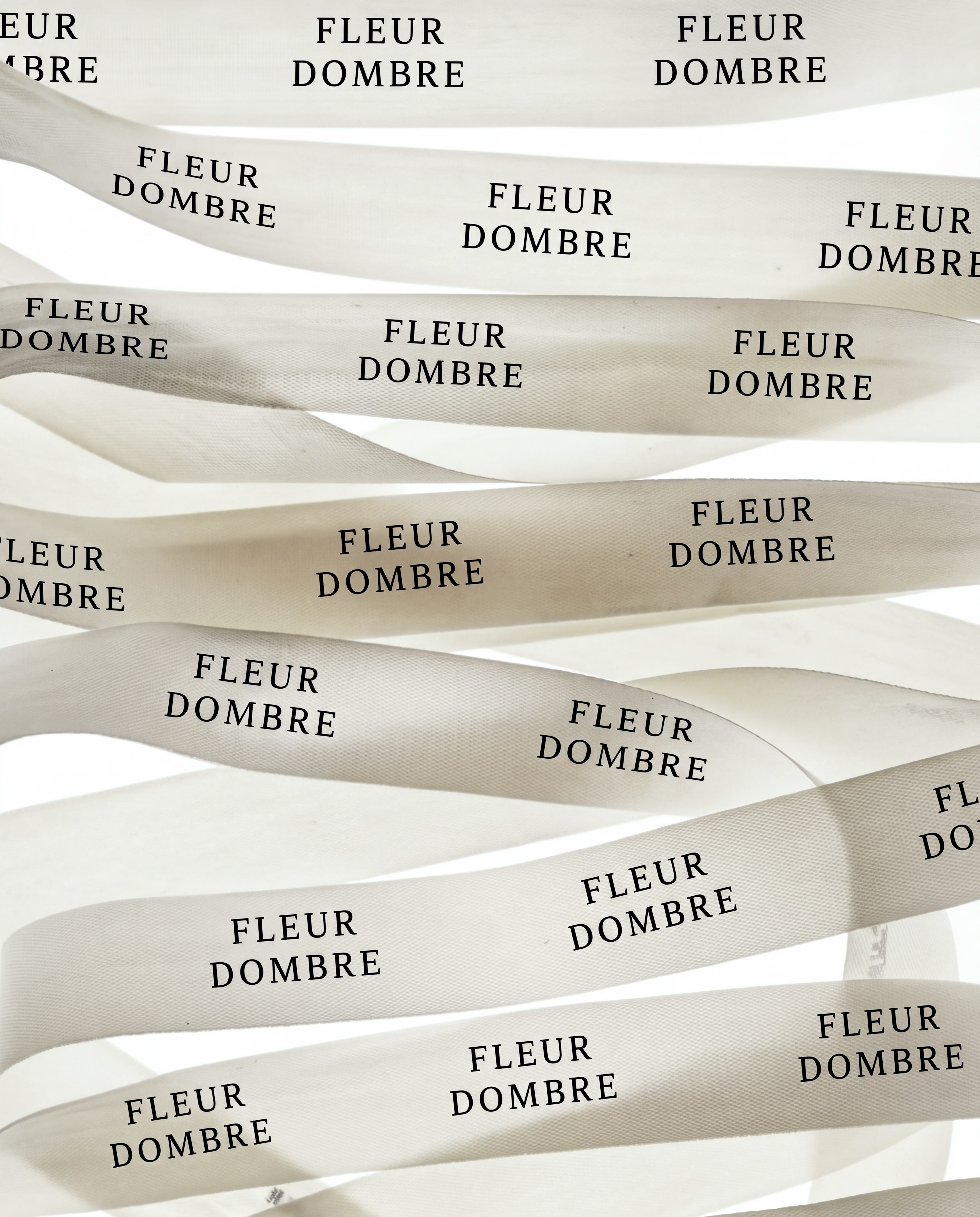
Typography was pulled from French print tradition to anchor the brand in place rather than trend. The system extends unchanged from logotype to wrapping paper - one language, applied without compromise across every physical touchpoint the store produces.
Conclusion
The project explores balance between aesthetics and function – where every element, from typography to materials, contributes to a consistent brand experience. Designed to stand out within a competitive market, the identity creates a clear and recognizable positioning.