DUORA
Introduction
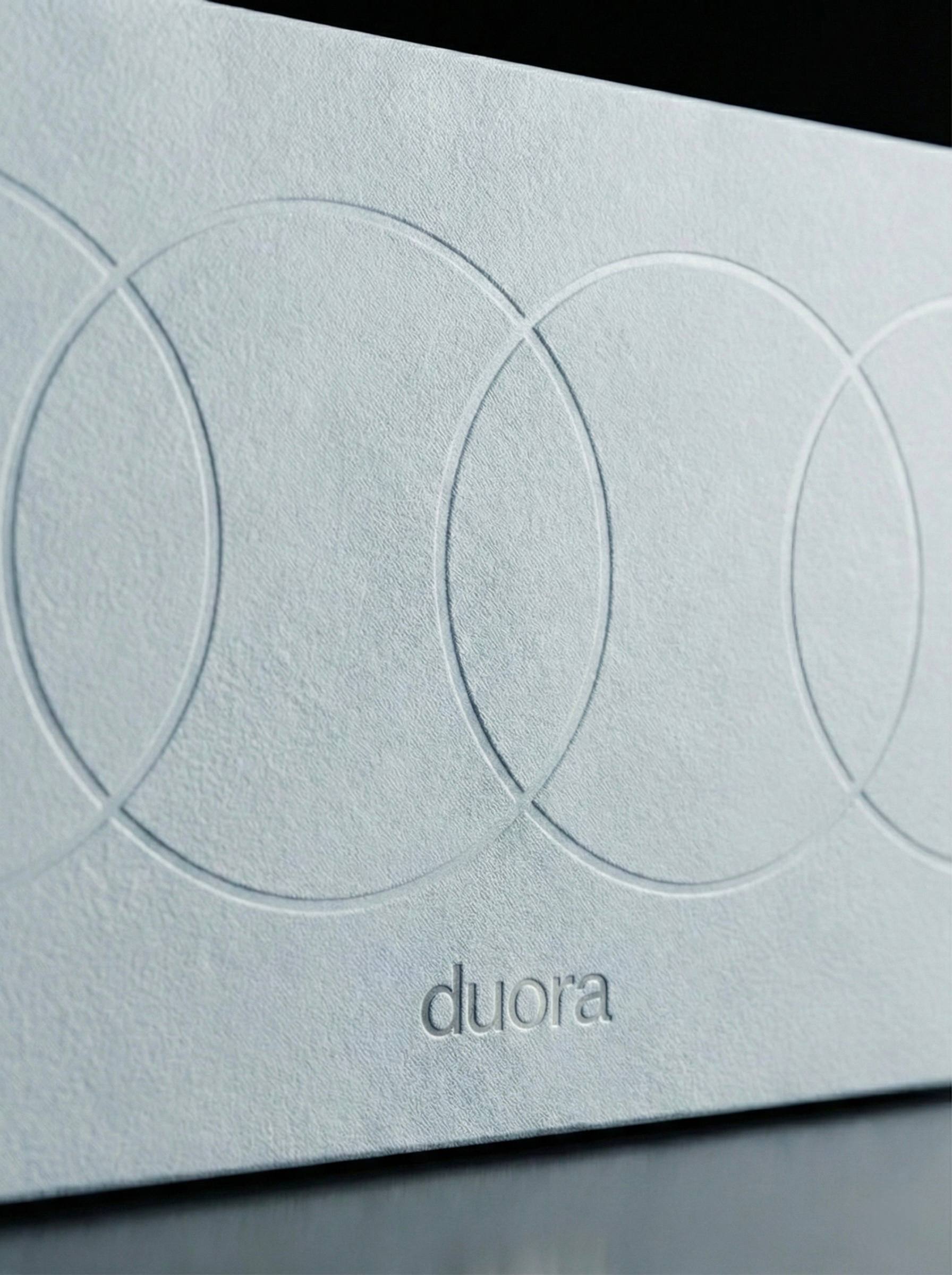
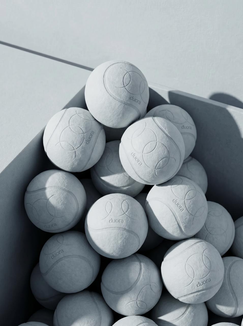
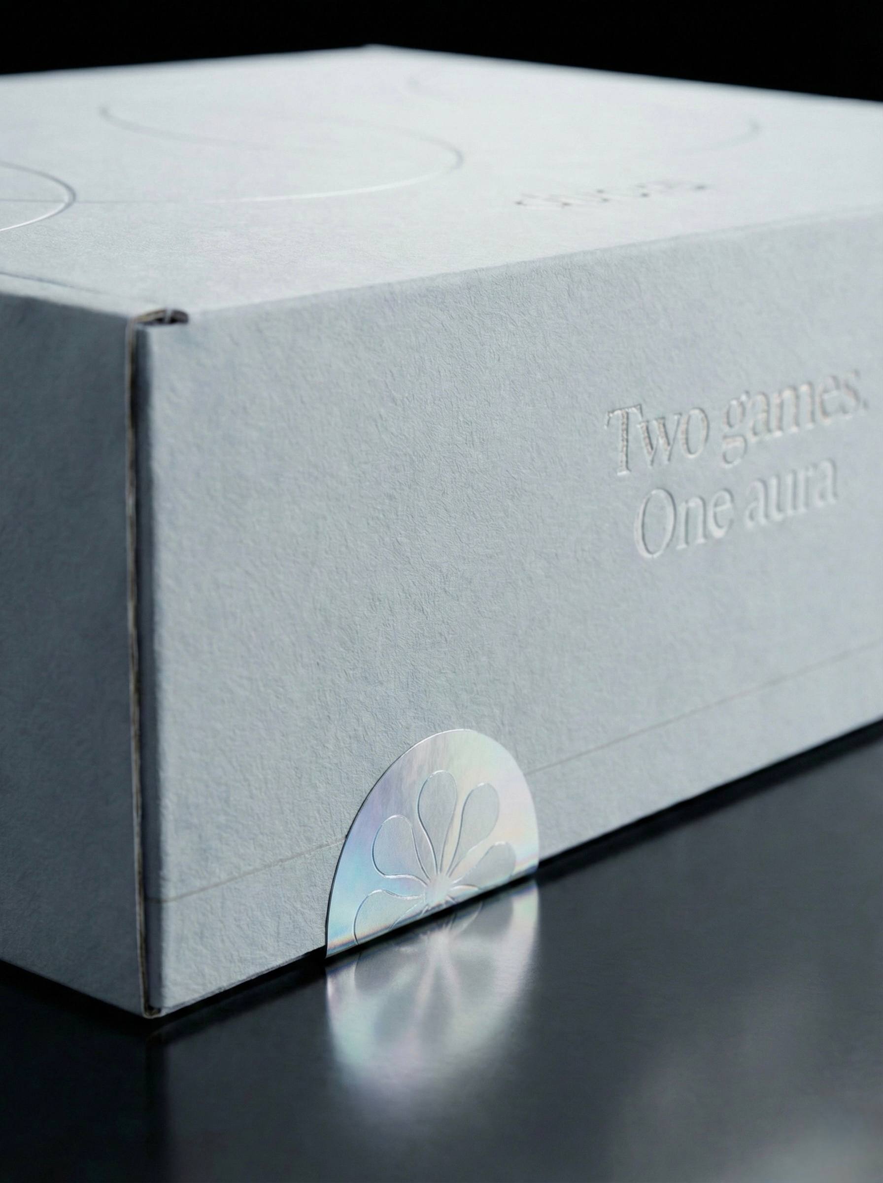
A sportswear identity focused on performance, clarity, and modern aesthetics. The visual system is designed to balance functionality with a strong, recognizable presence.
Process
Research and Discovery
The process studied how performance brands age - which hold, which date. The brief centered on one demand: a brand that lives equally on the field and in the city.
Visual Direction
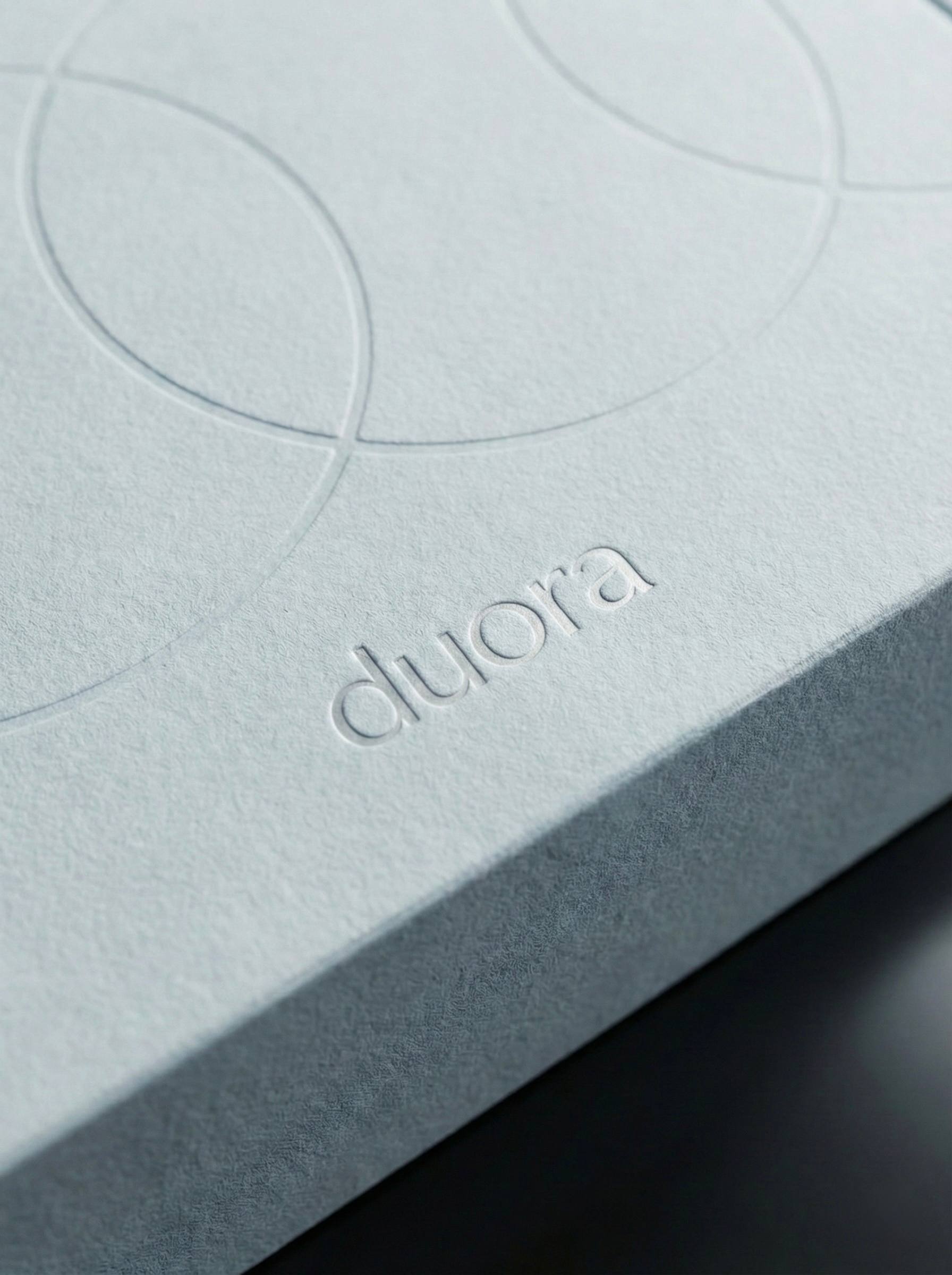
The mark was built around structure and reduction, designed to survive two very different tests - a stadium jumbotron and a product tag.
Typography and System
The type system reads at distance and in detail, governed by one rule through the entire process: if it needs explanation, it's not working.
Conclusion
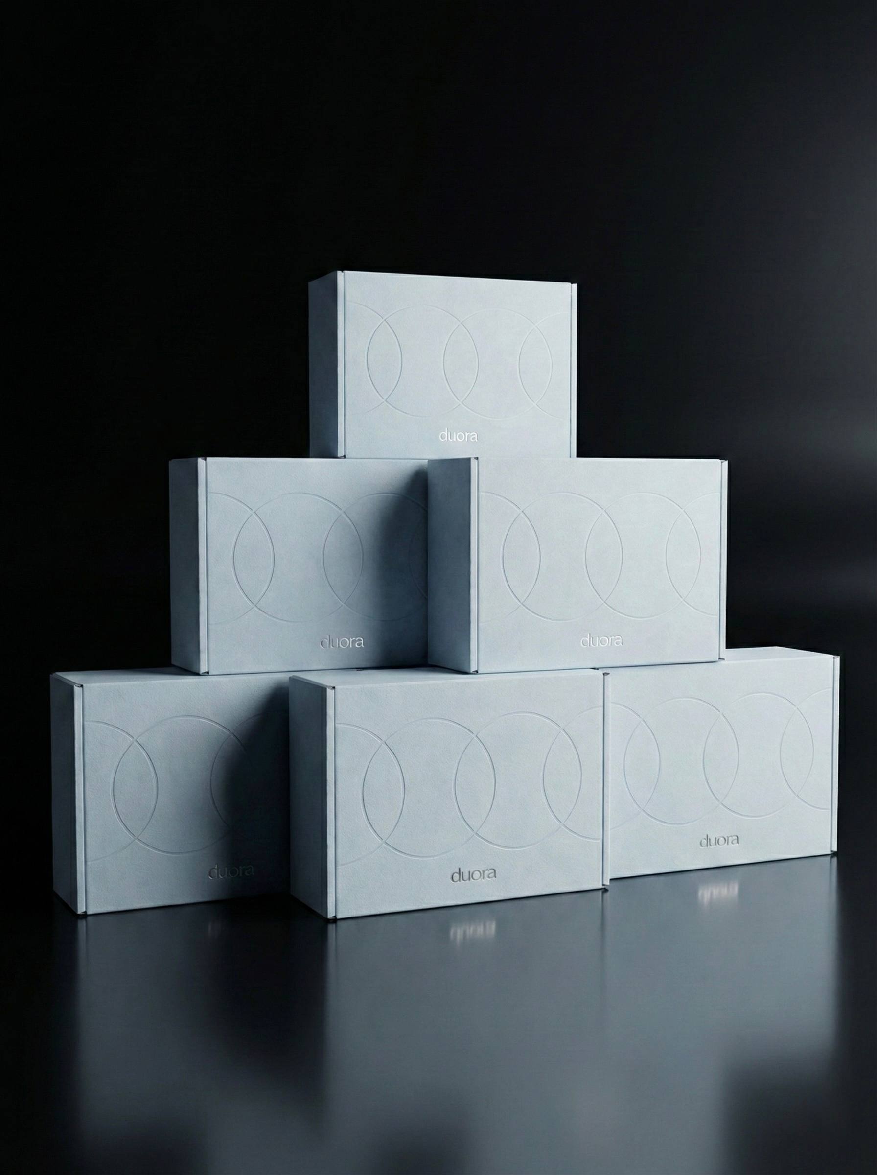
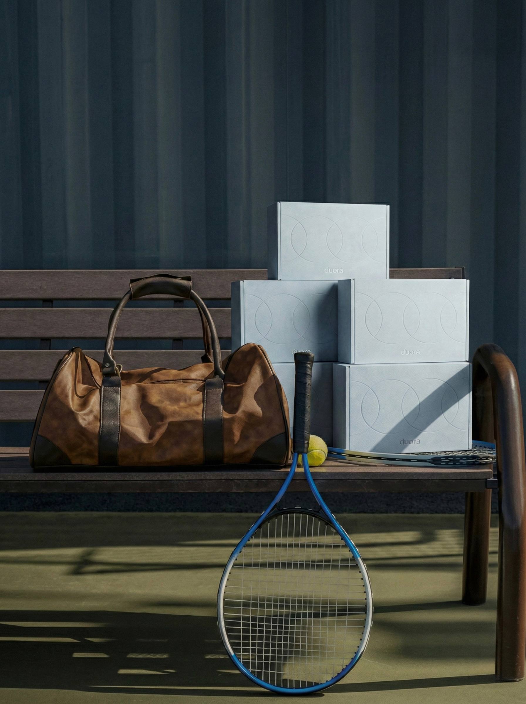
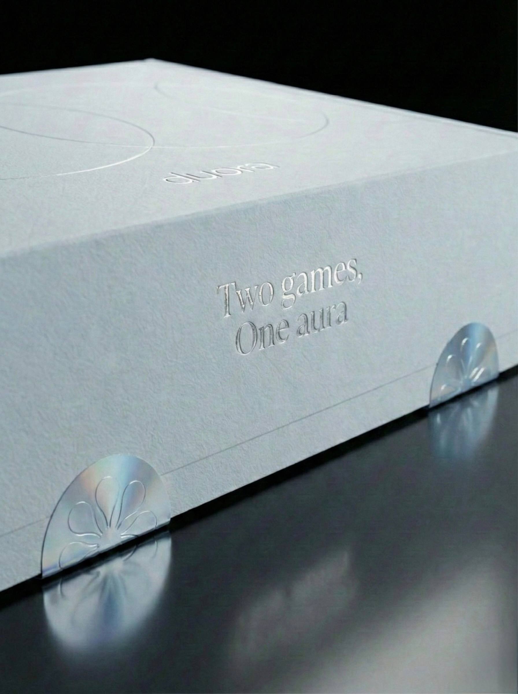
The project explores balance between aesthetics and function – where every element, from typography to materials, contributes to a consistent brand experience. Designed to stand out within a competitive market, the identity creates a clear and recognizable positioning.